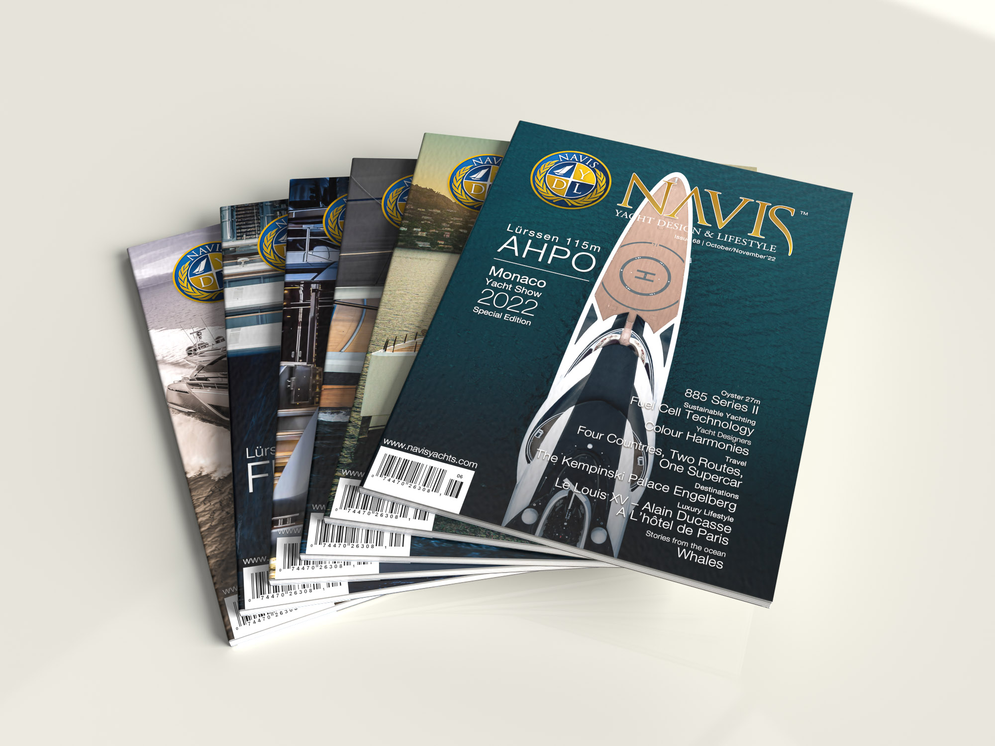
At Flat World Communication (FWC), we specialize in creating corporate identity design services that elevate brands and establish a strong visual presence. When NAVIS Magazine approached us, they had a bold vision—to build a yachting media network like no other, catering to yacht owners, superyacht enthusiasts, and luxury lifestyle connoisseurs. They needed a brand identity that would seamlessly connect megayacht design with the essence of luxury while standing out in a competitive industry.
From the outset, NAVIS wanted a timeless yet modern identity. A common challenge in luxury branding is ensuring that classic design elements don’t appear outdated. Our goal was to craft a visual identity that exudes sophistication while remaining relevant for years to come.
We began with the foundation of any strong brand—its logo and color palette. Inspired by nautical elements, we incorporated the compass rose and yacht silhouettes to reflect rhythm, movement, and exclusivity. Gold and deep blue were chosen as primary colors, reinforcing the prestige associated with the superyacht world. This cohesive aesthetic was then extended across all brand assets, including the magazine templates, book layouts, website design, and media kit.

One of the key challenges was striking the perfect balance between classic and modern. NAVIS needed to feel luxurious but not old-fashioned, timeless but not static. By carefully refining each design element, we ensured the brand embodied both tradition and innovation. The result was a unique corporate identity that positioned NAVIS as a leader in the yachting media space. In fact, its distinctive branding has been so impactful that major competitors have begun adopting similar design elements.
Beyond the visual identity, the strength of the NAVIS brand is reflected in the magazine itself. Readers have embraced its 160-page format, appreciating the stunning imagery and high-quality writing that immerse them in the superyacht lifestyle. NAVIS has successfully cultivated a loyal audience, solidifying its status as a premium publication in the industry.
As the brand continues to evolve, NAVIS is considering a refined approach—shifting to a typography-based logo and phasing out the icon. This evolution aligns with our philosophy at FWC: strong design should be adaptable, allowing brands to grow without losing their core identity.
The NAVIS project showcases the power of strategic corporate identity design services. By blending luxury, innovation, and timeless aesthetics, we helped create a brand that not only resonates with its audience but also sets new standards in yachting media.
If your brand needs a sophisticated and impactful corporate identity, contact us to see how we can bring your vision to life.


